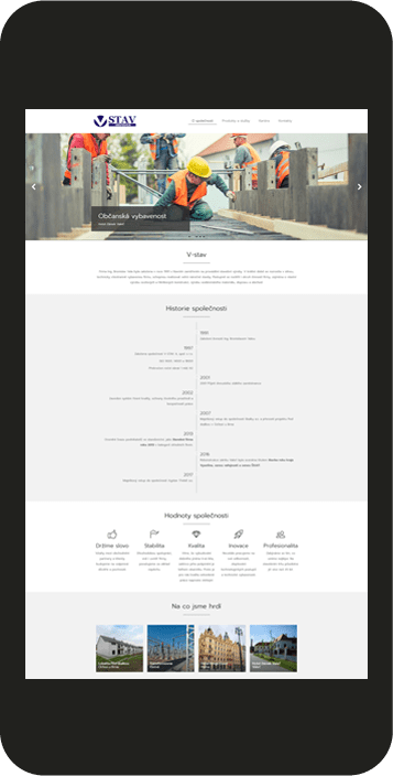
Are you aware of the “first impression” effect? In case of web presentations and e-shops, this effect holds twice as much. The way you present yourselves in the world of the internet is primarily evaluated by each visitor. It’s the appearance of your website or online e-shop which influences whether the customer uses your services, purchases your products, or leaves for your competitors. We create each web design according to proper principles and methods of UX design. At the same time, we pay attention to the originality, comprehensive structure, easy applicability, and accessibility of your website.
Webdesign for everyone
Thanks to responsive web design, your e-shop or website will be displayed by users of all devices, be it desktop computers, laptops, or tablets and smartphones. We also optimize websites and online stores for the so-called Retina Displays, i.e. displays with a higher density of pixels, used by the Apple brand.


Mobile first
Smartphones are slowly but surely becoming the most used of all devices. Therefore, a lack of a responsive web design results in a loss of customers and favourable rankings in search results. Allow your visitors to comfortably view your website not only on a desktop computer or laptop, but mainly on their smartphone.
Although all types of devices are important to us, taking mobiles into account first when creating a graphic draft of your web is the most effective. Thus, Mobile First is a way of creating a graphic draft even for the smallest of displays. Simple, comprehensible, and well-arranged graphics is our motto.
